
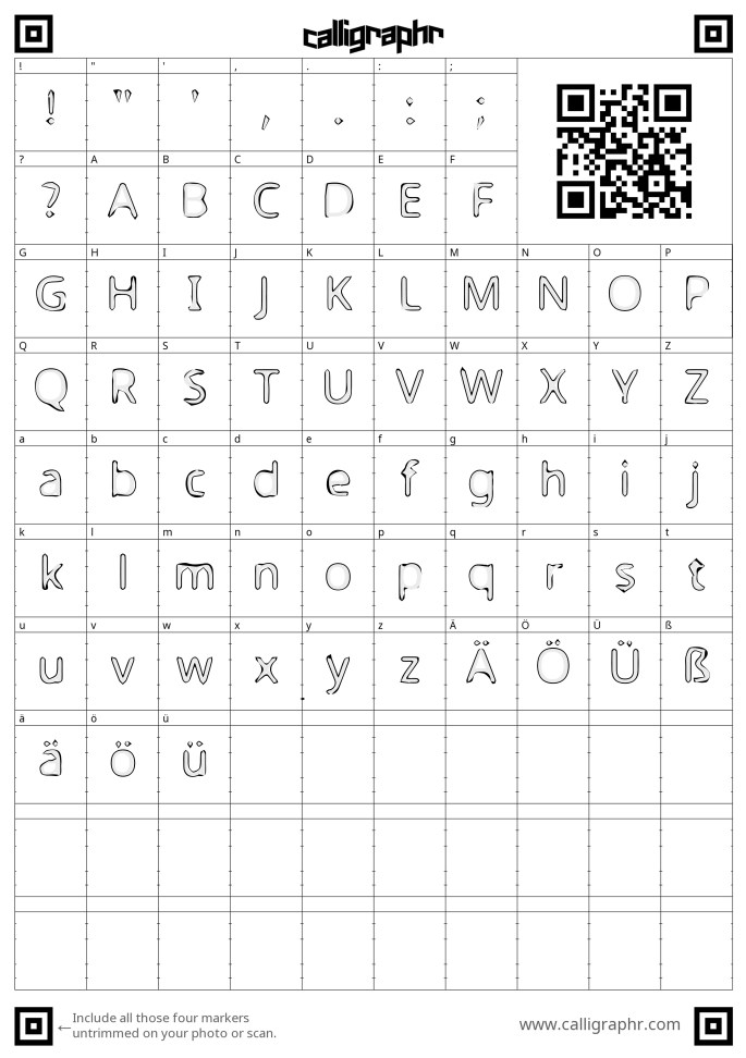
Starting this project I wanted to dismantle the idea of a font by looking at the idea of generating a dysfunctional font. I first created a rather standard, yet disintegrating one using a template which worked to some extent as can be seen bellow.
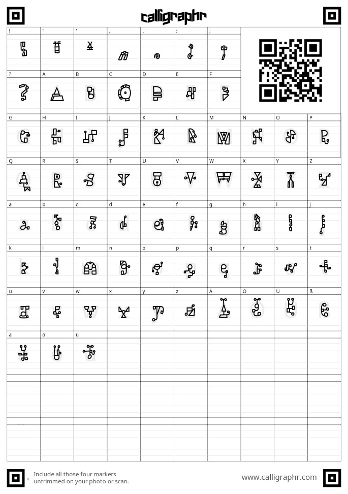
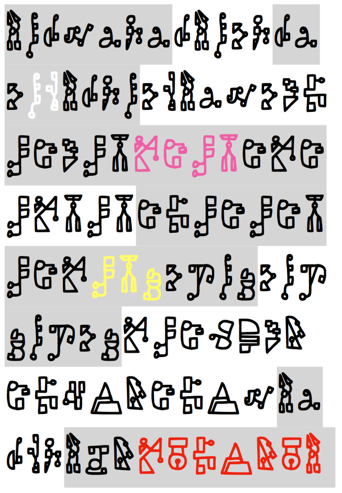
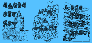
After creating this font, I realised that I could push the idea of abstraction and removal of form much further. I created a font which is made up of basic two dimensional shapes linked by lines and drawn in outline as you can see bellow.

Here you can see some compositions I have put together using this font. I intend to further this idea by potentially printing and animating with this font an maybe furthering the abstraction.


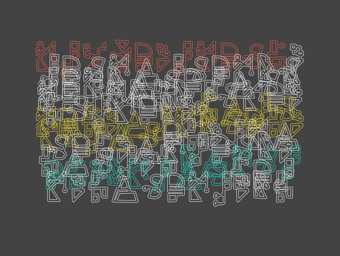
Overlaying this font on top of itself creates unusual looking aesthetics. I also feel that it links back in many ways to the forms of hieroglyphs. I want to look at how hieroglyphs are understood and how I could use these as forms within my typographic work.
https://hieroglyphicsinitiative.ubisoft.com/en-GB/update
The link above goes to Ubisoft’s hieroglyphic initiative where they aim to allow computers to read the middle Egyptian language via neural networking and machine learning. The public can go on and trace symbols which in turn allows computers to understand variation that could exist within each symbo. This is the only perceivable way to database the language due to it having over 1000 characters. Bellow you can see how the system works in practice:
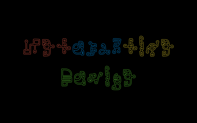
Here you can see how I have implemented this text into a processing sketch, allowing it to rapidly generate. I intend to convert this into a dynamic sketch and then use this to create some form of text animation.

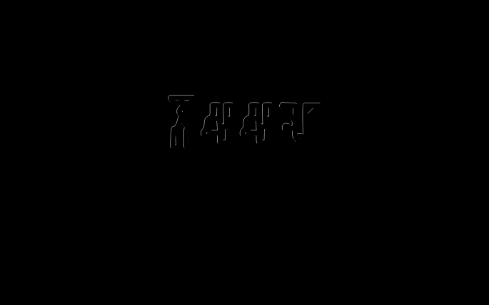 Bellow I have created 2 morphing videos using my typeface and a developed version of the previously shown processing sketch. The first is the text alone and the second having it overplayed on-top of snow being swept away. The purpose of the font is in a way to be a shadow of a letter. What I mean by this is that it is a partial representation on a plane of something with deeper connotations.
I think I want to focus on this idea by taking significant imagery to myself, repurposing these into graphics. This allows the viewer to take a view at my own life experiences in a very 2 dimensional and shallow experiential way. I think with the movement and the confusing text, the whole viewing situation becomes too intense and less valuable to those who see it.
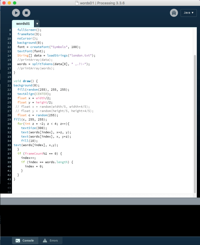
I create prints of memories that were significant to me. I wanted to explore the idea of how context adds significance. The regular viewer wouldn’t be told the meaning behind the image or text. Instead they have to solely use their own life context to attempt to understand it. This creates disparity between the way every viewer sees it.
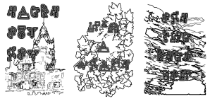

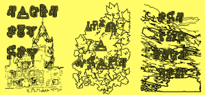

I like the way the text instantly jars you view of that behind it. However I think less graphical approaches could work with photographic imagery behind and simplified versions of the text. In these examples the text is only symbols. However I could use words that link to the memories but only in my own eyes or error codes linking to the idea of corrupted memories lost in time. This displays the same concept that these prints do. However perhaps there would be more the viewer can see into and in turn would allow them to delve deeper into themselves.

After creating the above prints, I decided that I wanted to experiment with tracking text onto objects in order to add some form of focus to b-roll style clips. I used the motion tracking function within after effects in order to track the same sequence of random letters onto objects.
After creating the above sequence of tracked clips, I decided that I would actually go ahead with the text on-top of photographic prints idea and created several focusing on slightly colour altered images with vibrant text first.

")
")
")

After this I realised I wanted to make the prints as bare as possible with the text only slightly leaking into them. I feel in some ways, these were more successful and make the text feel more immersed rather than the whole image being very overpowering.
")
")
")


