
Looking at varied angles to view data from. Manipulate ranking and placement to change the data’s impact. Internet Download Speeds by Country could be changed to reflect this easily.
Florence Nightingale and the Pie Chart.
Edward Tufte Mocks bad date visualisation. 3 Dimensions is a distortion of reality and therefore doesn’t represent data in a clear manner.
InformationIsBeautiful.net Scale of Devastation. Showing the size of disasters. Scale is only understandable when proportionate to other measurements.
Information Graphics vs Data Visualisation. Info Graphics is simpler in many ways. Data Vis often conveys complex relations between ideas.
Hans Rosling’s 200 Countries, 200 Years, 4 Minutes. The Joy of Stats. Jer Thorp Weight of Data Ted Talk. Simulated Economy with pixels trading colour with each other. Communism to Terrorism graph, changing how we look at data.
CSV File – Comma separated Value. Making data sets. Using Mockaroo to create fake data file sets as CSVs. Equivalent of plain text file but for a spreadsheet format.
This video looks at how data can become uncovered and how we can use data visualisation methods to uncover new data which may have otherwise never been noted.
This videos plays upon similar ideas by looking at stats overtime and using animation to represent this in a clear form. It appears as though a projection across real space although it is evident the visual was added in post processing to the clip. It enlightens us to the way life expectancy has changed over the past 2 centuries but also the income scale seems somewhat skewed due to the nature of inflation within our society.

Here you can see the first data visualisation using processing and Mockaroo. It generated a chart of drugs and their prices which is extremely random but allows us to have a base point to move on from.
outputcolour Here you can see a further iteration of the same concept, displaying the titles of the drugs alongside the graphs and with colour implemented within this system which is determined based upon the value of the graph between a yellow and pink.

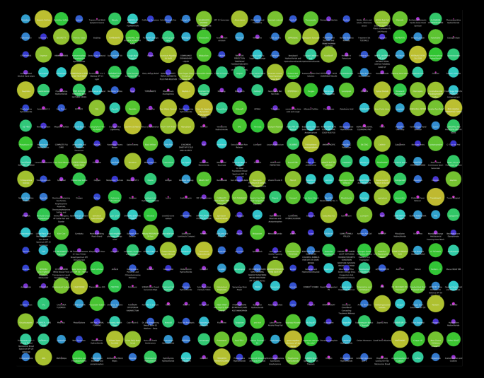
Here is a further visualisation of the same data using different sized circles instead. It shows how data can be displayed in a completely different form which makes it appear and be understandable on a whole separate level. It is somehow less tangible but speaks in diffrent ways, highlighting the larger drugs much more with the smallest priced ones becoming almost intangible and un-viewable.
Viewing Population as audio tone, viewing pound to euro conversion as audio. Using unusual data sets and visualisation methods to provoke viewer or listener.
Here is a link to an article which states some Data Visualisation Key Points for things which a designer could consider while trying to create provoking visualisation for data they intend to use.
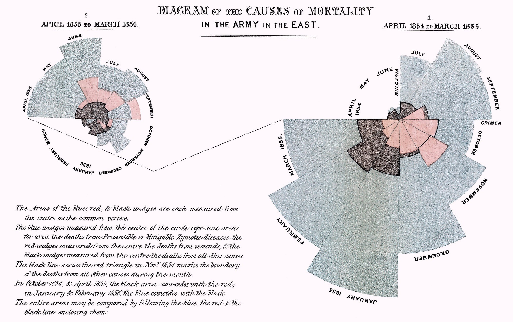
Here is an early Pie chart which was created by William Playfair and popularised by Florence Nightingale. It allows data to be seen in a more whole sense as a 360 degree rotation of data means that there is no finite end and start, but data seems to fill up a whole existence rather than just a selection of it.
Here you can see lists of Population Data for each country of the world and I can download this as a CSV file to use the data to form visual ouputs.
Here you can see a video discussing the concepts behind the idea of dna heritage results. They take stats and compare them to the individual looking to find out their own heritage. From this they extrapolate their potential lineage. However as this video details, so much of this is merely speculative and guess-work. It does display how data can be used to aim to display factual information when in fact, it is never as concrete or finite as such results. This can mislead and persuade people into false or misguided beliefs.
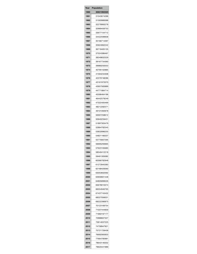
Here I have repurposed the data from the world population by country into population of the whole world and year in a simple CSV file. I am going to use this to generate tone and image in a combined piece to display how our world is surging in people as a brief test of data visualisation.
Crossing two kinds of data in order to create flat data. This is playing upon the concept of data visualisation being very subjective and how using raw data in a decisive way can be corrupt. This plays ironical upon overly dramatised concepts and allows the viewer to understand how data can be swayed and exasperated.
Here I have found a whole list of Data Sets. This will be useful to attempt to generate contrasting data sets which form flat data.
[Wind Map] [NightWatch] [High Altitude] [Human Sensor] [Vending Machine]
Data Manipulation is a concept which seems to cause results that certain people desire or want. It revolves around the idea of adjusting data to make it more understandable or readable. However when this is used by a human with a subjective view of the world, which we all have, it becomes skewed. I want to look at data sets and data visualisation where the data has been heavily twisted to suit a motive and then potentially do this myself to parody the idea. I may compare data which has no correlation but appears to correlate due to the existence of chance.

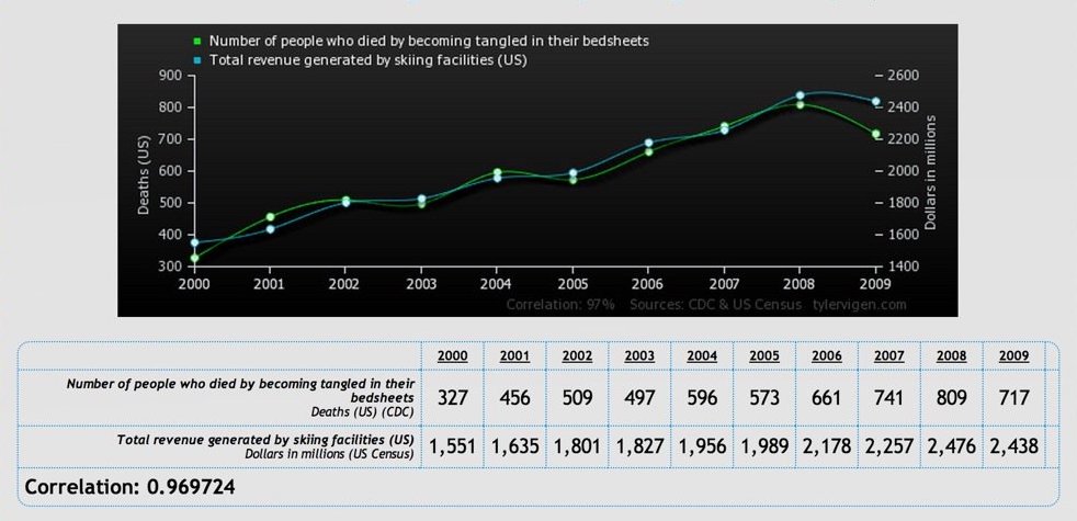
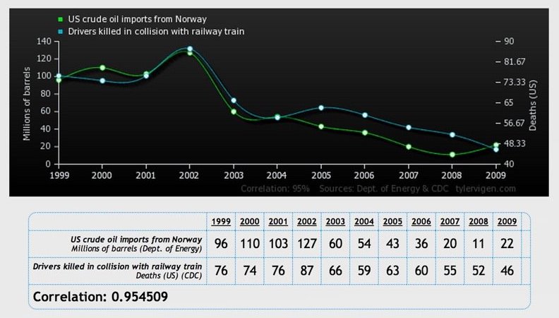

Here is a series of graphs generated by an anonymous source which show completely chance based correlations. However once seen in this format, we begin to believe that it may be plausible that there is some link between them. If we chose selected sets of information and present it in certain ways, links can appear between most patterns


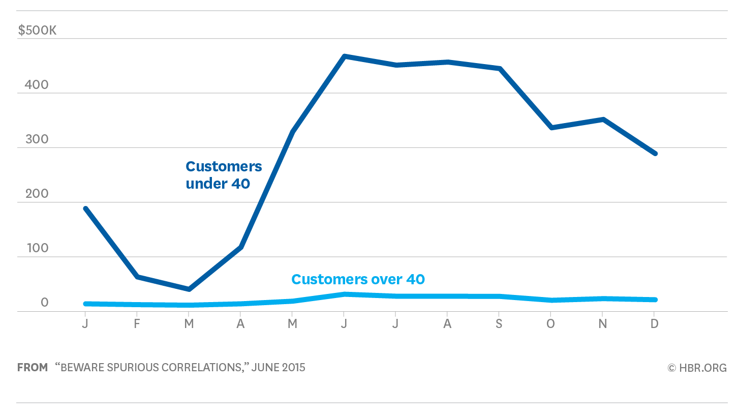
These images also show similar ideas and are sourced from an article called Beware Spurious Correlations on the Harvard Business Review. They explain and show how data scales can set and display disparity and heavily affect the way we view two pieces of data alongside each other.
Moving on from here, I think I should find similar data sets where the stats have been portrayed in completely diffrent outputs. For example cute round cirles over jarring polygons.

I think I can output in this way by looking at my own data which I could generate and looking at trivial data sets in both lighthearted and political manners. This shifted look upon data would allow me to understand more deeply how the media bombards us with opinion and attempts to form it into fact.
[Project Gutenbeg] [Red Noise] Text websites for text understand and manipulation. Alternative facts and non-fiction belief. [Average Colour] Site for showing the average colour of an image file. This could be some kind of data visualisation. (Data Soliloquies)
Here is a processing sketch I generated which feeds from the population CSV that I altered earlier. The size of the text, saturation of colour and year displayed, as well as rate of song played are all mapped to the population data.
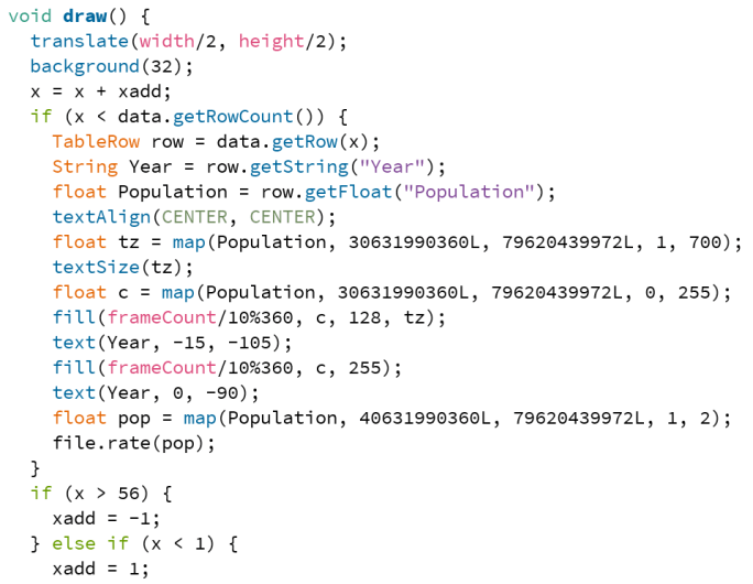
Here you can see the draw section from the code. It uses mapping from the string year to generate different variations of scale and other changing factors. As seen in the video the number and audio bounce back and forth in a rather aggressive way which makes you question what this visual is displaying.
I like the fact that the viewer cannot instantly tell what the displaying visual is referencing. However once you realise what the data is questioning or revealing, it can be quite jarring due to the way I have mapped the scales. I could map the scales in a much more proportionate way which would show how using a specific scale can change the effect data appears to have. This would change the impact the data has upon us a viewer. Here you can see the values re-maped below, which in turn reduces the change of the visuals and is actually a scale representative from 0 to the current population.

However you could question which one more rightly represent the data. On the one hand the data is more proportionate, but it could also be argued that this plays the data in a way that understates the dire state of population growth and almost appears to brush under the carpet, the issue we could have on our hands within this century.
Looking at other forms of data visualisation which display similar or identical data in drastically different ways will allow me to further understand how visual representation alters our perception.

Bloom – Fernanda Viegas and Martin Wattenburg
Mori: an Internet Based Earthwork
Following on from my previous idea of finding different representations for the same source data, I have looked at the above visualizations of seismic data from the Hayward Fault in California. This is very specific piece of data in many people’s eyes and the way both groups have taken drastically different approaches. The raw data is identical and both are live and constantly shifting however the way they diverge from one another is in the way they output this data.
I feel that in many ways this opens my mind to the concept of varied visualisation. I want to myself explore this potentially with my own mock data set. I will try to create a simple data set from reality or fantasy and then vary the way in which I extrapolate and map this data to visuals. This will allow me to realise the potential variation available and further my narrative in exploring data interpretation.
Here you can see a series of images for visualisation I made as an experiment. I wanted to attempt to visualise a data set in two drastically different ways. One focusing on mundanity and one on exiting visuals. I decided to create a mock data set where Coco Pops on the kitchen floor in my flat were counted each day. New Coco Pops were dropped each day by accident so I created both a column for new pieces and a cumulative set.


I wanted to look at how both different interpretations visually and within the data itself lead to diffrent results. One may seem to more clearly show the increase in value whilst not actually representing it clearly.
This is the first visualisation which shows the amount of new Coco Pops each day for the 3 week period. It id mundane but you can clearly see the increase. It shows when none were added and when many were and you can see the slight changes. It is factual but lacks impact as the increasing amount of pieces cannot be viewed.
Here is the second visualisation. I created a processing sketch which when you drag the mouse from left to right progresses through the days, adding the cereal that was on the floor each day. This shows the cumulative amount of Coco Pops instead which has much more impact as it means more in the real world. It also visualizes it in a more vibrant form which makes you more invested in the idea. Even with something as mundane as crumbs on the floor, you can still find intrigue within it and want to know more. I feel that this point is almost the reason I chose the data set as it allowed me to experiment with how I can draw intrigue from a viewer from a very boring data set.
Moving on from this experiment I think it helped me greatly i advancing my conceptual direction even though it might have seemed very whimsical. It allowed me to realised I want to focus on the highlighting of the mundane, and using data visualisation to make the boring of interest to a viewer.
After mulling over my ideas for a while, I realised that data maintains a position as undisputed truth to many people. This seems to be a value which is unraveling around us in our current political climate. The ability to abuse the nature of facts in order to further personal motives has always existed. However this is always followed by heightened requirements of data to constitute evidence. Data seems to have somewhat escaped this vice. Photographs constituted substantial evidence until recent times, and now, even video is losing is pertinence as it becomes easier to forge fake reality. I think making something impactful revolves around this disturbance of photographic existence. By visualising data through edited photorealistic imagery, I can gain a higher sense of factuality.
Future of Data Visualisation This article references similar ideas with the concept of amalgamating many stills into a strong form of data, transforming that which seems incredibly mundane into something which is undeniably entrancing in my eyes.
When data visualisation is so mundane it doesn’t have a purpose, only an output, that is when it becomes more pure. It loses its impact to some extent but allows the viewer to imprint their own understanding upon it. I am going to aim to generate provocative but motive-less imagery which presents data to the viewer. Everything is Data Without Reason.
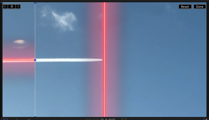
Moving on from the idea I just had I decided to put it into practice. I filmed a plane flying almost parallel to the train I was sat on. I thought to do this because it seemed to move in a way almost relative to the train I was on. I was thinking about how it definitely isn’t moving at the same kind of speed as the train and probably isn’t parrallel so I wanted to look at ways to understand this relationship better.
Here you can see the same video but the line of the airplanes jet stream is stabilised manually so that it doesn’t change position or angle while the footage around it does. I feel that this in itself doesn’t appear to show much but when you crop this down so you aren’t aware of the stabilisation the analogy becomes much clearer.
Here is the footage cropped down where the plane appears to be moving at a perfect parallel to the train. This visualisation highlights the way in which data itself is altered and distorted to suit an alteria motive of the creator.
Here I have quickly scanned across the footage which in many ways shows the stabilisation of the video to the line within it. This furthers the concept that without the viewpoint from a certain angle, data seems conclusive and clear. However once we view it in alternative way it falls apart.
Here I found the flight number of the plane by looking at the time and location I took the photo and going on a flight mapper online. The only plane that it could have been feasibly was KLM611 which was flying somewhat parallel to the train which runs alongside the M74. The distance of the plane is at least 12km with the height at the moment being unknown.
Seeing the plane from this completely different angle flips the way we understand it as data and physically. It seems so much more distant and inconsequential now that we realise how far away it truly is.
Looking at the videos I made, I am trying to understand how the stages I visually undertook link to the way data is abused and construed into new forms. The way I see to evaluate it, the stages I created correlate as follows:
Recording Data/ Removing Context

–> Altering Purpose/Visualising Data

–> Stripping The Data/ Further Removing Context.


Here I have attempted a similar idea with a toilet flushing, stabilising the footage to focus on the flusher itself. It remains static in the shot while everything else moves around it. In the video below you can see how I mapped it to a static red line overlay. I think it brings into question how we analogize data visualisation and its misuse.
Also when we view the stabilised flusher rotated 360 degrees at a steady rate, our minds seem to not fully believe in its stability which brings into question our own visual understanding of the world around us. So much of what we see is based upon preconceived notions of what we regard as fundamental truths.
I think moving on from here the basic description of my project would be: Creating a Visual Metaphor Which Shows How Data Visualisation Distorts Data.
Analysis of project reasoning so far
Everything is data. Yet visual data is regarded as less substantial evidence due to our ability to manipulate it. We often seem to overlook our ability to manipulate data in numeric form. This visual demonstration aims to show to the viewer how numeric data can be distorted by its remapping and uses video and photographic methods as a metaphor. Not only do these visuals show how our understanding of reality can be altered through the alteration of data, But they also show how stubborn our human precognitive thought can be.
When you view toilet handle rotating at an even pace around its central axis, you Cannot believe that the rate at which it turns is in fact steady. Furthermore even when a line of equal and steady pace is overlaid on top of the image our minds cannot comprehend that the visuals we are seeing could be stabilised in a way allowing it to move at an even pace. Once the imagery is moved but the line is left we understand fully how the line moves at its constant rate, However even after this revelation once the video is re-added into the shot we lose the ability to see its even pace clearly once more.
This inability to comprehend in my mind forms an incredibly strong analogy for how data visualisation takes information and removes it from as its source distorting its measurements and removing excess data. When we view data like this it appears clean and we can understand it well. However this is the same as when we view the line without the background imagery. We can understand it but without context its relevance is lost.
We use data visualisation in order to explain concepts to other people in tangible ways. However by doing this we lose so much of the information which is relevant to the situation that we must really question whether it still remains relevant to the argument in question.
Although data visualisation is useful in some formats, it will always remain subjective in my eyes contradictory to what the name suggests. When we represent ideas which mean a lot to ourselves, to display them in such a mathematical format seems the only option. But could be not find new formats to unleash political and scientific thinking, representing our philosophical beliefs in more emotive formats?
The visualisation I have formed here is unrefined aesthetically for a purpose. The representation of data has become to clean in my eyes. Too cold and calculated to allow for human emotive expression. Because data seeks to position itself as undisputed truth it must represent itself in this way. However with my own visualisations, I aim to put forward how my findings are personal opinion and therefore creating rough unclean visuals, allows for the crude charm to shine through the imagery. How can you flatten every essence and beauty of the complex existence we call reality into a graph? Focusing on a toilet handle by stabilising could also be seen as a way to hone in on the tiny fantastical intricacies of life.
The visual from the plane trails shows the overall concept of how data moves from its derived origin to a processed chart or visual display. I think this goes hand in hand with this spinning toilet handle visual both aiming to unmask that which lies underneath what we see as data vis. I feel that to truly exaggerate the unpolished nature of the imagery, clean aesthetics should be used around them to form strong contrast and highlight their imperfections.

Here I carried on further experimenting with the idea of using this plane data in order to drive a re-destabilisation of the footage. However I soon realised that the point I was trying to drive forward within my work was somewhat lost when doing this.
This made me realise I needed to find an appropriate data set along with video media to accompany this. I started researching data sets I could use or create to enable this.


I started to realise a lot of the information about selfcheckout I had passively discovered over the previous few years could be extremely relevant. This is an issue of battle between the machine and mankind. In this area, self checkouts are replacing humans but humans almost seem to fight back against this computerization by stealing from shops in what seems like a mass event constantly. It seems almost as though the money saved by the machines is also lost through them ironically.
This seems to mirror the idea behind data vis where machines create deep data comparisons to explain points, but humans break this system by falsifying the purity behind this idea and using this now false belief to further their own motives.

Here I have generated a table based around facts I found on the internet around produce stolen and self checkouts installed across the uk. I want to use this to further fuel the work I am going to create and potentially use processing to form the de-stabilisation.
In my piece, what I am trying to almost reverse the roles of the machine and the human in some sense, but also return the purity to data. I will stabilise shots and then get the machine to use the data to return the reality to the imagery and return the unstabilised nature to the footage.
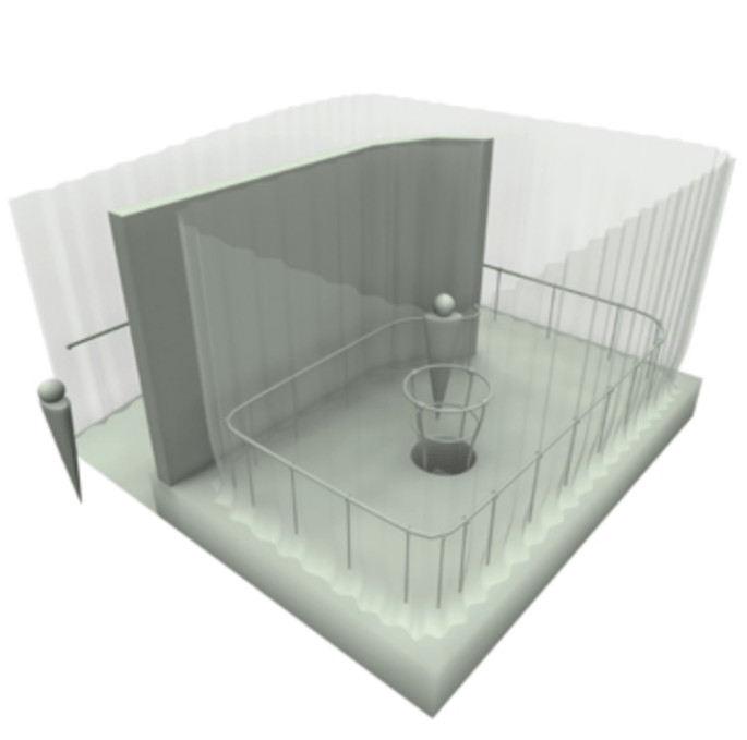
Here I have created the stabilised footage using a mask. I think this mask could also be used to allow the parts of the data to be displayed on top, i.e the year of the data displayed in one of the outer circles, the stolen amount in another circle and the number of self-checkouts at that time in a further one.
Here is the same footage without the overlay to further show how it is stabilised.
Here I have increased the speed of the clip to 16 seconds in order to allow each year to represented as 1 second within a processing sketch and therefore be mapped with a time function in processing.


Here is several overlay variations which I experemented with. I tried out diffrent background fills and sized circles. However I then realised if I include a background, if I want to have repeated layers over and over on top of each other via looping the clip back through processing to corrupt the data further, it would all be lost due to huge sections being masked off. I think therefore I will just have the basic circles which will in themself overlay but this won’t take up the entire shot on screen.


Above you can see the sketch I explained with a placeholder pink square along with the code that runs it. Also I have some overlay developement for the sketch with the 3 pieces of data from the above sketch aimed to be positioned into each of the coloured circles. I need to implement the video into the piece and change the font and scale of the text. With the tests I have been doing, I think this overlay will reveal itself over the duration of the destabilization, and with each iterative run-through, it should corrupt further and gain more noise as the transparent layers pile up. This in theory should eventually make the visual so corrupt it is unreadable which is the aim. This will create an analogy for the idea that the more we manipulate our data ourselves the more it loses its clarity.
Here you can see iterations 1-7 of the first test process. I like the scrambled and additive look that develops, however I feel that because of the faded black around the middle circle, the layers can’t really grow much beyond the first few version. I also feel that at the origin, the size could be slightly increased from 0 so that the screen image is never really pure black. Besides this, potentially the rotation rate could be increased but with these small changes, and further itterations this would occur anyways.
Here I recreated the overlay in Photoshop which made it transparent enough to allow many repeated iterations to be overlayed. I decided to stop at 12 because the effect was no longer having a huge effect for visual purposes.


")
These images show the final overlay along with me editing it in Photoshop. I think that in some ways it looks quite old-fashioned or outdated, but I chose this due to the nature of how I’m questioning th cleanness of data vis. You can see its unorthodox effect especially on the still from the 12 iteration above where the Rubicon lies in the middle. All the overlays from the overlayed iterations are overlapping and forming an almost white colour by combining.
Final Submission:
My final submission is composed of these two films. The first only further displays the concept behind my project with the second being the main outcome.
The general point which I am attempting to convey across this project is this fight between humans and pure data. Machines allow us to generate data in a raw way, with every pure intent in mind. However humans have realised the power data as a formulae has over us and use its innocent facade to fuel their own motives on a daily basis. I am questioning this deceit and mocking it through these films. I have become the machine, and then used the machine itself to manipulate my data to fuel my motive, twisting the regular into something quite unusual.
I have used quite broken and disjointed versions of data visualisation techniques from a bygone era of the early internet, even featuring dreaded forms such at the gradient to create a somewhat distasteful and deformed looking aesthetic. I have formed feedback loops within the work to emphasise the impact that our trust in data has on looping back heavily manipulated data into the public eye.
I think in some ways this project appears unclear and hard to explain. This is because I want the viewer to feel a sense of loss when watching the imagery to create a sense of loss in their mind. This turns to a thought to delve deeper into the reason behind the work and in turn into the twisting of data as a whole. Questions are posed, some answers are given, but many doors are opened for the viewer to push their own interest in finding out what data really is and what it should mean to them.
